Redaction: A Typeface with a Cause
Inspired by legal briefs, Redaction challenges the Justice System one pixel at a time
Most people think of fonts as quiet design tools, there to make text readable, clear, and perhaps even a touch more attractive. But what if typography could reach beyond aesthetics, challenging the very systems that wield power over people’s lives?
Redaction, a typeface created by Forest Young, Global Principal and Head of Design at Wolff Olins, and type designer Jeremy Mickel, owner of MCKL, manages to achieve this by turning letters into a vehicle for protest. Commissioned for The Redaction exhibition at MoMA PS1 by artist Titus Kaphar and poet-lawyer Reginald Dwayne Betts, the typeface became a crucial extension of their work, exposing cash bail injustices and how the US criminal justice system traps marginalized people over unpaid court fees.
Using legal documents provided by the Civil Rights Corps, Betts turned dense court briefs into poetry by redacting text to reveal hidden narratives, while Kaphar created haunting portraits of the incarcerated.
The Backstory & Inspiration
Recognizing the need for a typeface that could capture the raw, fractured essence of Betts’ poetic redactions, Kaphar reached out to Forest Young, an old colleague from Yale, who then brought in Jeremy Mickel, a master of type design with a knack for infusing concepts into letterforms.
Together, they set out to design a typeface that transcended basic readability, while capturing the themes of suppression and erasure at the heart of The Redaction project.
As they dug into the source material, the team noticed something interesting. Since the files were repeatedly faxed, photocopied, or scanned, the letterforms became bitmapped, stretched, blurred, and fragmented–sometimes almost unreadable. It wasn’t just a quirky detail; this slow decay felt like a metaphor for how marginalized voices often get lost in the legal process. Inspired by this, the team decided to weave that sense of degradation into the font design, turning it into a statement about visibility and erasure.
Degradation Breathing Life into Redaction
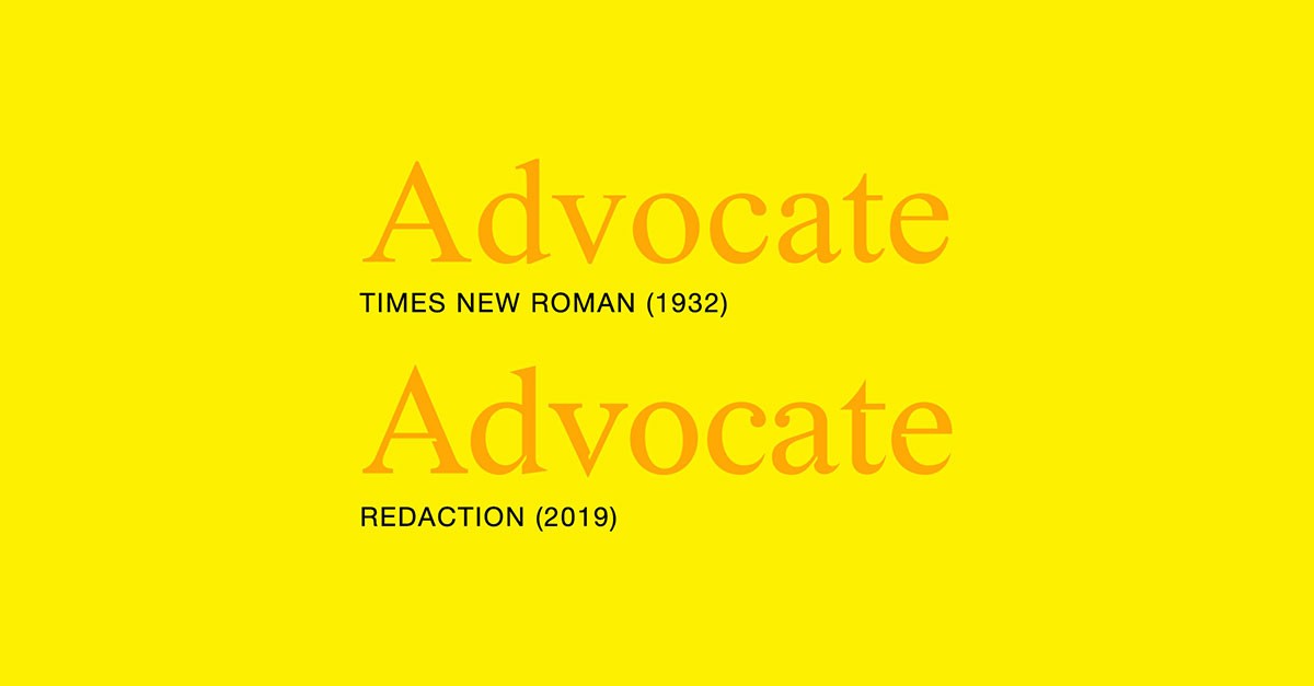
The design team began with two classic legal fonts, Times New Roman and New Century Schoolbook, which are widely used in official documents. The goal was to create a typeface that combined elements of both fonts but also had a distinct feel that would fit with Kaphar and Betts' work. Although early versions of the hybrid typeface showed promise, the letters lacked the strong contrast and urgency needed to fit the impactful tone of Kaphar and Betts' project.
The designers found inspiration in the symbolism of the United States presidential seal, where an eagle holds arrows in one talon and an olive branch in the other. This became a metaphor for the dualities in the justice system: harshness vs. kindness, conflict vs. peace, hard vs. soft, light vs. dark. They applied this concept to the letterforms by making rounded shapes softer and more fluid, while sharper shapes became even more angular. This exaggerated contrast created a visual tension that felt right for the project.
They then revisited their earlier studies of degraded text and decided to add "negative shapes" or gaps within the letters to mimic the digital artifacts that appear when documents are repeatedly faxed or scanned. They also took inspiration from Peter Saville’s album cover for New Order's "Power, Corruption, and Lies," which uses subtle details to blend modern and historical elements.
They experimented with placing pixels in certain areas of the letters, like where strokes meet in characters like "H" and "E." However, they had to tweak this approach to make it look convincing on more curved letters like "n" and "s." This process followed what they called an “inktrap logic,” meaning they deliberately inserted gaps (or "traps") into many letters, along with details like a square dot on the lowercase "i" and the period.
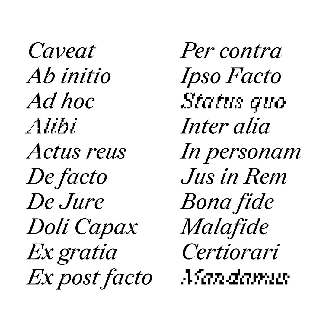
Drawing inspiration from early bitmap fonts and the pixelated designs of Susan Kare for Apple, Redaction was crafted with three styles–Regular, Italic, and Bold–and seven levels of degradation. The first grade is clear and formal, while the higher grades become blurred and challenging to read, creating a tension between readability and obscurity. These degradation grades range from crisp and precise to pixelated and nearly unreadable, mirroring the journey of legal documents and those trapped within bureaucratic processes.
Today, pixelated designs are quite popular, and you can find many similar fonts online. But for the creators of the Redaction typeface, using pixelation meant more than just following a trend. They created different versions of the font, ranging from slightly clear to almost unreadable, to show how people in the criminal justice system can become ignored or pushed aside. It also underscored the idea that making text legible is a form of power, placing responsibility on those who write to ensure that their message is accessible.
Since its debut at MoMA PS1’s The Redaction exhibition, the typeface has been made available for free download, complete with a full Latin character set that supports multiple languages.


